Guide Objectives:
- Identify the right data visualizations for your story
- Simplify your data visualizations to the essentials
- Use human perception to emphasize data insights
“Data visualizations” are graphical representations of data that communicate insights. They consist of visual elements, such as charts, graphs, infographics, and maps, that make complex datasets more understandable and accessible to audiences. In other words, they are used to help make sense of the data we are bombarded with on a daily basis.
When telling a story about your organization, a program, or even research, a well-done data visualization can emphasize that story. When created with a story in mind, data visualization can make key insights stand out for your audience.
To do this, just like writing a novel, there are principles and practices to best tell these “data stories” or insights. This guide is designed to showcase these principles and practices.
Guide Specific Disclaimer
It is important to note that, unless we are careful, visualizations may misrepresent data or mislead decision-makers, ultimately causing harm. It is our job as designers of visualizations to consider the types of stories our visualizations tell, in order to best mitigate the risk of misrepresentation.
Determine the right chart to showcase your insights
We recommend starting this process with an idea of the story you want to tell using data visualizations. With this story in mind, you will be able to select the most effective chart. There are several types of charts, each one having value in showcasing different types of data and insights.

This diagram, Chart Suggestions – A Thought Starter, is a good place to start.
For a more detailed breakdown of the use cases for each chart, you can refer to the definitions and images provided.
More ways to get started on data visualization:
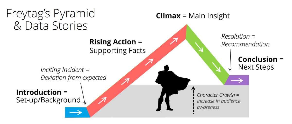
If you need a hand deciding on the story you want to tell, you can refer to Freytag’s Pyramid. Freytag’s Pyramid is a dramatic story structure that is commonly used to analyze and map the plot of a story. While originally applied to literature, it can also serve as a useful framework for designing engaging and effective data visualizations.
Selecting the Best Chart
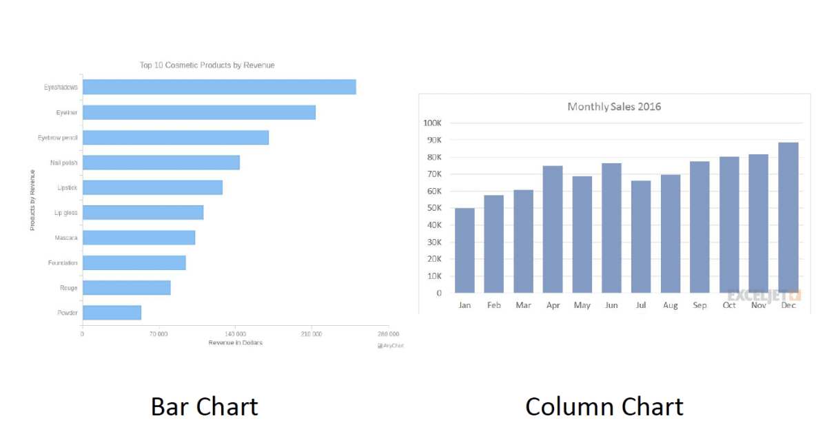
Bar & Column Charts – when comparing across categories; Example: comparing diabetes rates in a given year across states
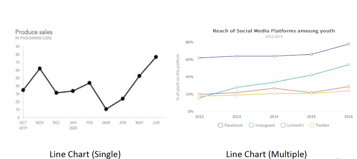
Line Charts – when following the specific path of data points through time; Use case: showing the trajectory of diabetes rates from 2000 to the present year
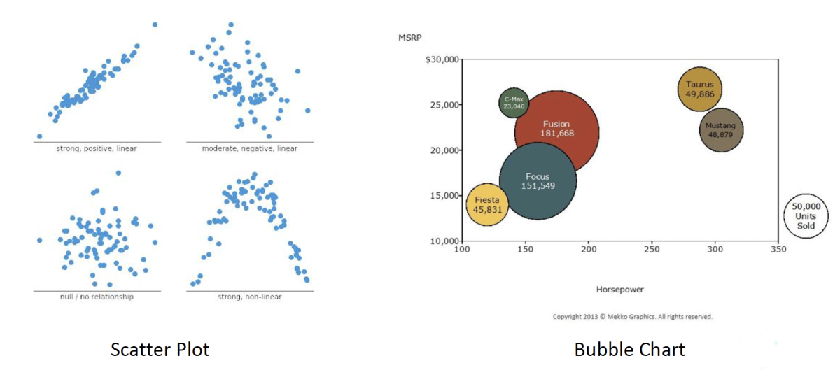
Scatter Plots & Bubble Charts – when associating the relationships between two or three variables; Use Case: associating per capita income and diabetes rates through a scatter plot
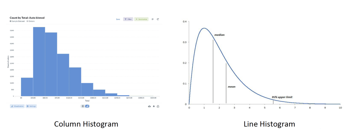
Histograms – when reviewing the distribution of discrete or continuous data within a category (salary ranges, weight ranges, etc.); Use Case: comparing diabetes rates by populations of different income ranges
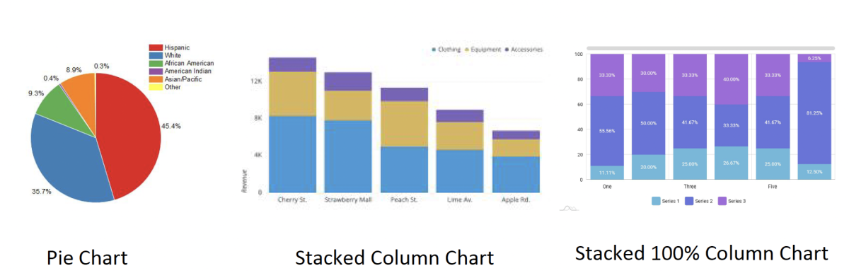
Stacked Column or Pie Charts – when breaking down the composition of a group; Use Case: looking at the percentage breakdown of ethnicities of people living with diabetes
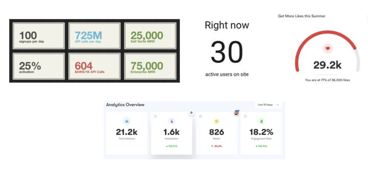
Number Charts – when you just need to show large, critical numbers or metrics; Use Case: showing the number of people living with diabetes
Utilize Gestalt Principles of Perception
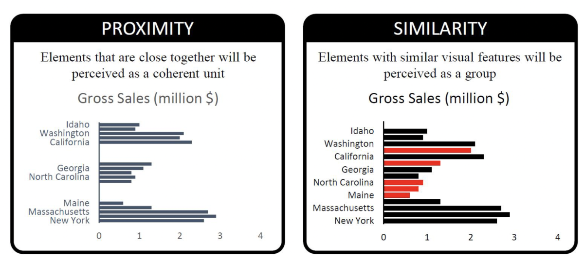
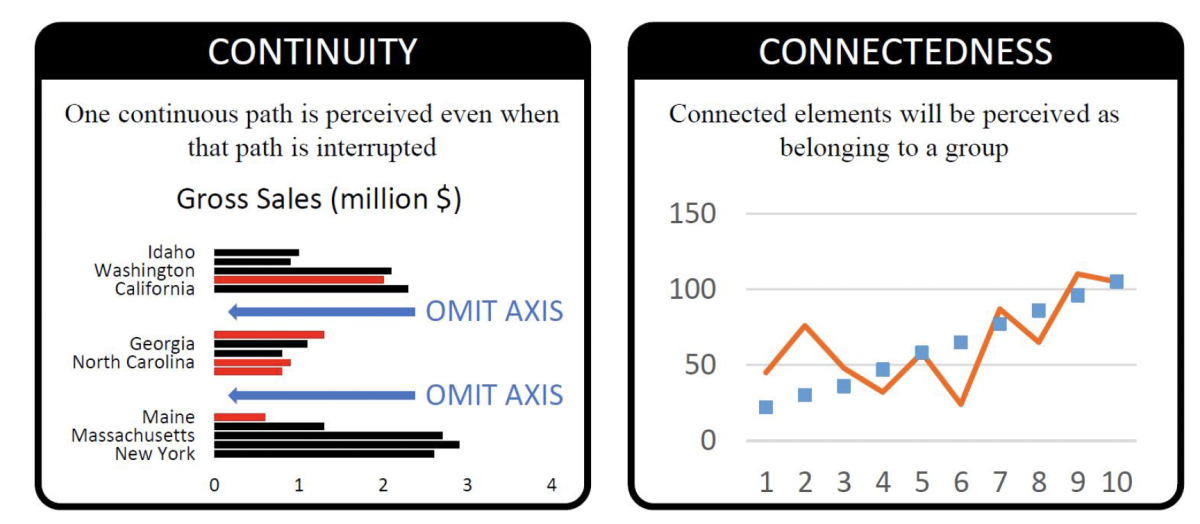
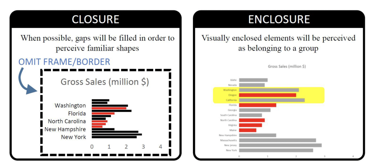
Now that you have identified the best chart type to tell your story, it is now time to design your data visualization. At this stage, it is important to familiarize yourself with the Gestalt Principles of Perception. The Gestalt Principles of Perception are a set of principles in psychology that describe how humans tend to organize visual elements into holistic patterns and perceive them as wholes, rather than individual parts. These principles include concepts such as:
- Proximity – elements close together will be perceived as a unit;
- Similarity – elements with similar features will be perceived as a unit;
- Continuity – one continuous path is perceived, even when that path is interrupted;
- Connectedness – connected elements will be perceived as part of the same group;
- Closure – gaps will be filled to be perceived as part of the same group
- Enclosure – visually enclosed elements will be perceived as part of the same group
These principles, among others, help explain how we make sense of visual information and perceive order and structure in the world around us. You should consider each of these principles to best emphasize your insights and key relationships when developing data visualizations.
Minimizing distractions on your chart
Keeping the Gestalt Principles in mind, the next step is to minimize distractions in your data visualizations to develop clear and engaging stories. Essentially, you want to further emphasize your insights by reducing the clutter (or “chartjunk”). Chartjunk can come from distracting formatting, unnecessary text, highlighted colors, and more that take the audience’s eye away from the insights and stories you want to tell, and move them in the wrong direction. It is up to the visualization designer to determine what is chartjunk, and what is useful to emphasize the insights.
Minimizing Chartjunk can be done in many ways. In general, when distracting or unnecessary, we recommend:
- Removing backgrounds
- Removing redundant legends and labels on axes
- Removing borders
- Removing colors (unless highlighting points or groups)
- Removing special effects (ex. Shadows or 3D graphics)
- Removing bolding
- Lightening text
- Lightening or removing grid lines and axes
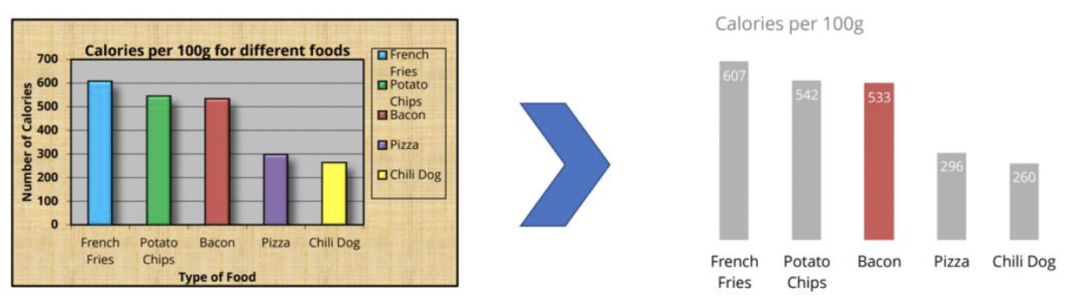
- Directly labeling data points (if possible)
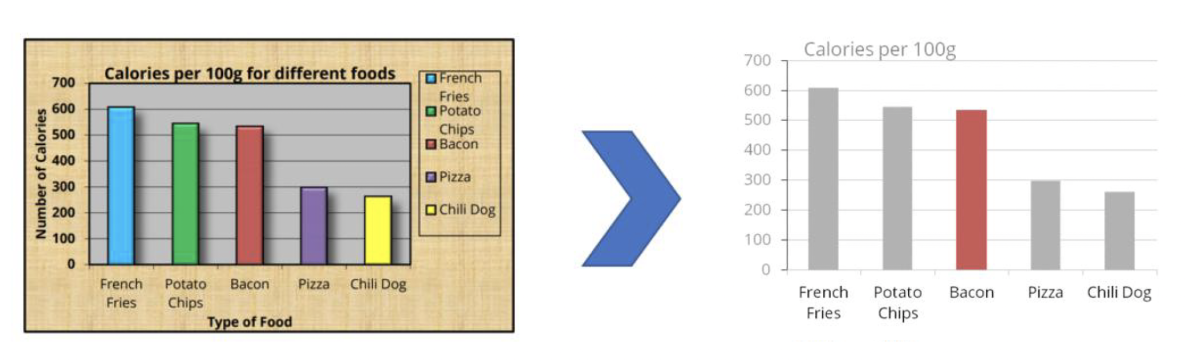
Example of Minimizing Distractions on Chart
In this example, we remove borders, bolding, grid lines, redundant legends, and special effects, among other things, all in an effort of emphasizing only the story we want to tell.
Remove background, legend, redundant axes labels…
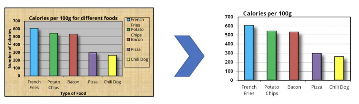
Reduce coloring, remove special effects, lighten text and gridlines
Reduce coloring, remove special effects, lighten text and gridlines
‘So what’ and next steps
After completing the guide, you should now have the key principles and techniques to design data visualizations that emphasize the stories you want to tell. If possible, pilot your data visualizations with a sample audience to ensure your data story is coming across, and the data is not misleading.
Data stories are most effective when they are aligned with your organization’s mission. You can dive deeper into this with the guide: How to align data collection to your organization or project’s overall mission
Was this guide helpful? Please rate this guide and share any additional feedback on how we might improve it.