Training course and modules
The three cohorts of the three-month Africa CAN training program supported participants to strengthen their data science skills and learn how to work with climate and health data. The program was designed for government officials, academics, and members of civil society, as well as data professionals who wanted to deepen their data skills and use them for social development. It focused on building literacy and analysis skills in climate and health data, then moved on to working with more advanced tools for predictive modeling and data analysis, such as Python, R, dashboards, and geospatial tools.

Table 1 provides a closer look at what this training encompassed and how it was structured. It features the schedule for the third Africa CAN training program, which ran from February to June of 2025. Below this, you can find information on how the curriculum evolved and was updated for cohorts two and three to include more case studies, a greater focus on peer learning, and a tighter focus on the African context. Each program was updated based on feedback and lessons learned from the previous cohort. For more on how the impact of the training was evaluated, see this chapter.

Table 1: 2025 Africa CAN training schedule for cohort 3.
Training Provider

Module 1: Introduction to data for the climate and health nexus
This module looks at the intersection of climate and health, how data can be used and overlaid, and the current landscape.
| Week | Level | Session content |
| 1 | Beginner | Welcome to CAN |
| 1 | Beginner | The African data landscape |
| 7 | Intermediate | Machine learning in the African context |

Module 2: Data wrangling basics
Module 2 focuses on how to organize messy data using spreadsheets, simple ways to clean and fix data, and basic techniques to understand and fix patterns in data.
| Week | Level | Session content |
| 2 | Beginner | The principles of tidy data and how to achieve them using spreadsheets |
| 3 | Beginner | Data cleaning and standardizations |
| 4 | Beginner | Basic analysis and exploratory data analysis |

Module 3: Health data
Module 3 explores what an ideal and impactful healthcare data system looks like, how data can guide key decisions such as how to manage resources and plan better care for communities, how to use map and location data to track diseases and plan health responses, and a simple view of how our genes can influence health and how scientists study these patterns in populations.
| Week | Level | Session content |
| 2 | Beginner | What would a perfect healthcare data ecosystem look like? |
| 4 | Intermediate | Health data for resource allocation and health system planning |
| 7 | Intermediate | Geospatial data and health |
| 11 | Intermediate | Introduction to genetic epidemiology |
Module 4: Climate data
Module 4 dives into where climate data comes from and why it matters, how climate change affects people and communities, how data can help create smart strategies to adapt to these changes, free and easy-to-use tools for tracking climate issues, and a case study on how data was used to protect mothers and children from extreme heat.
| Week | Level | Session content |
| 3 | Beginner | Data principles, context, and sources for climate data |
| 6 | Intermediate | Climate impacts and adaptation strategies with data |
| 10 | Intermediate | Open tools for tracking climate issues |
| 13 | Intermediate | Case study: Data-informed adaptation strategies to address risks to mother and child health due to extreme heat |

Module 5: Advanced data wrangling
This module covers the basics of using Python and Google Colab, working with data using Pandas, more advanced ways to analyze data (including finding patterns and relationships using statistics), and an introduction to machine learning and building models to make predictions and solve real-world problems.
| Week | Level | Session content |
| 5 | Beginner | Getting started with Python and Google Colab |
| 6 | Intermediate | Getting started with Pandas for Python |
| 7 | Intermediate | Advanced Python and Pandas for correlations and statistics |
| 9 | Advanced | Machine learning in Python |
| 10 | Advanced | Modeling for machine learning in Python, part two |
| 12 | Advanced | Predictive modeling |
Module 6: Data visualization and communication
Module 6 centers on how to turn data into clear, engaging stories using visuals that are easy to understand, the basics of visual encoding, how to use charts and graphs to communicate information, what makes an effective data story, how to communicate health and climate issues in ways that connect with different audiences, and using tools like Looker Studio for building interactive dashboards that bring data to life.
| Week | Level | Session content |
| 4 | Beginner | Principles of visual encoding and what makes a good data story |
| 12 | Intermediate | Communicating with data: Visual encoding and what makes a good data story |
| 13 | Intermediate | Health-focused climate communication |
| 15 | Intermediate | Building dashboards in Looker Studio |
| 15 | Your projects and wrap-up |
How the training program evolved
The training programs in 2024 and 2025 followed a similar structure but evolved to incorporate lessons learned from running the program, and to make the program as useful as possible as Africa CAN began to find its feet.
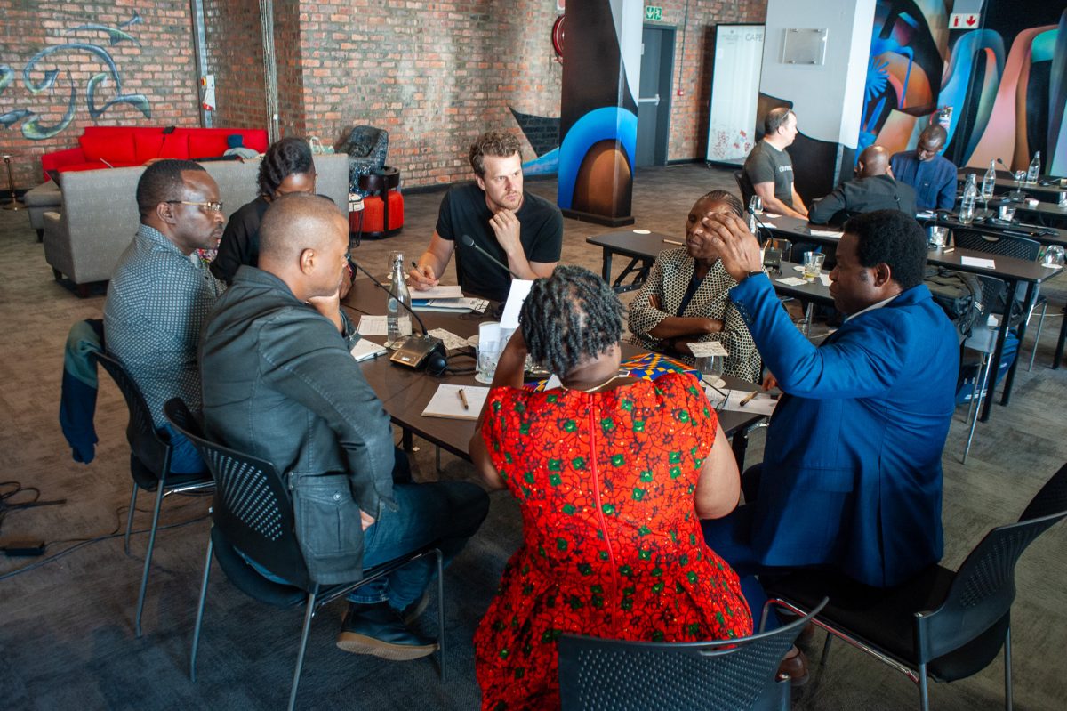
For example, the cohort 2 training, which began in July 2024 and was delivered by OpenUp, kicked off with an introduction to CAN and the African climate and health data landscape, rather than looking at climate and health data more generally. Participants were split into six learning groups to encourage peer support and learning; each group was given its own breakout room during Zoom calls, and a WhatsApp group for collaborating outside of the workshops.
While going through the program, the groups were encouraged to work together on a number of projects that would be enhanced by the use of data skills, such as preparing a presentation for a conference or communicating health or climate risks to the public, as a way to explore and experiment with some of the skills and tools they’d learned. This involved considering questions such as:
- Where do you find data?
- How do you test if it is reliable?
- Is it clean and tidy?
- How can you begin to explore it and develop hypotheses for testing?
- Do you need additional data to test your hypotheses?
From cohort 2 onward, the program also incorporated more case studies from organizations and projects using data for the public good, including Epiverse by data.org, a global collaborative dedicated to using data to get ahead of the next public health crisis; a session exploring the use of GIS tools for land degradation monitoring by the Regional Centre for Mapping of Resources for Development (RCMRD); and insights on the use of drone technologies for climate and health response by WeRobotics.
There was also a greater focus on making useful insights accessible through strong data storytelling, with sessions on what makes a good data story; health-focused climate communication; visualizing geospatial data with Open Street Maps; and building dashboards in Looker Studio or Microsoft BI.
Evolving virtual training strategies
| Participation barrier | Strategy | Outcome |
| Talent pipeline development | Launched storytelling initiatives to inspire participation. Implemented comprehensive data science and data literacy assessments (in cooperation with dataelements.io) to objectively screen registered candidates for more efficient talent pipeline management, and to gauge learning progress during and after training. | Registration surged following the storytelling campaign featuring Fellow success stories and multimedia content. Improved participant commitment through skills-based screening and enhanced program visibility across target sectors. |
| Completion rate challenges | Adjusted completion threshold based on attendance rates and industry research. Introduced comprehensive onboarding package detailing time commitments, technical requirements, course structure, and clear certification pathways. | Improved learner preparation and commitment with clear understanding of program demands and outcomes. Completion numbers improved from 21 (cohort 1) to 31 (cohort 2) participants, with cohort 3 achieving 198 completions out of 502 registered learners. |
| Limited learner feedback | Diversified feedback collection methods (Zoom, WhatsApp, Slack) and persistent chat channels for seamless community management. Broke long surveys into topic-based segments. Integrated surveys into course materials and linked completion to certification requirements. Incentivized feedback with automated milestone updates helping learners track their advancement toward certification. | Post-training survey responses increased from 18 to 23 responses between cohorts, with cohort 3 achieving over 90 responses. |
| Limited peer interaction | Introduced breakout rooms and WhatsApp groups for six learning groups (cohort 2 onwards); structured group work with 3–4 learners per group completing 4 collaborative projects throughout the course. | Enhanced collaborative learning and peer support networks with regular peer learning sessions and collaborative problem-solving. |
| Language accessibility barriers | Provided all learning materials in both English and French with simultaneous interpretation for live sessions. | Enhanced participation from Francophone learners and improved program accessibility across Africa. |
| Technical access barriers | Implemented unified virtual workspace requiring account login, mandatory dedicated email accounts for consistent tracking, comprehensive technical requirements documentation, and session recordings available within 48 hours. | Reduced dropout due to technical difficulties and with improved breakout room functionality and continuous engagement between sessions. |
| Limited practical application | Expanded focus on data storytelling and visualization skills, with group projects throughout training. | Participants better equipped to communicate findings and apply skills in practice. |
